
Barcbots.com Redesign
An Apple-inspired redesign of a competitive robotics team's website, turning a decade of competition data into a clean, confident digital presence.
Overview
A full-site redesign driven by design critique and iterative prompting.
Barcbots is a competitive VEX robotics team based in Cupertino, California with 13 years of history, 227 awards, and a 2023 World Championship title. Their original site was functional, but it still felt like a template rather than a reflection of the team’s precision and craft.
The redesign brought an Apple-inspired editorial system to every page: confident typography, restrained color, generous whitespace, and motion that helps dense information feel readable instead of overwhelming.
Problem
A world-class team had a website that undersold its track record.
The original barcbots.com had all the right ingredients: awards, season archives, robot photos, and team history. What it lacked was hierarchy, consistency, and a clear visual point of view.
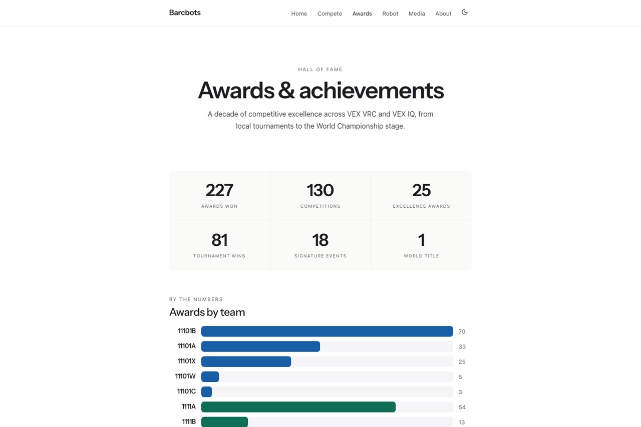
The awards page was the clearest example. It contained the team’s most impressive story, but presented 227 awards as a flat scroll wall with no meaningful grouping, weak visual categorization, and no quick way for sponsors, judges, or prospective families to understand the trajectory.
Approach
Audit first, define the system second, then implement page by page.
- Phase 1 - Visual audit: Review every page and establish the redesign direction around refined minimalism, typography-led hierarchy, and semantic color only where it adds meaning.
- Phase 2 - Interactive prototype: Build a working multi-page prototype to validate navigation, filtering, accordion behavior, and page rhythm before implementation.
- Phase 3 - Structured implementation prompt: Translate the redesign into a comprehensive implementation brief covering tokens, components, layout rules, responsive behavior, dark mode, and explicit constraints.
- Phase 4 - QA review and refinement: Compare the first coded pass against the intended look and write a second prompt to close the gap on typography, motion, and visual drama.
Contributions
Owned the design direction, prompt architecture, and final QA loop.
- Conducted a complete visual audit of the six-page site plus the season detail template.
- Defined the design system: typography scale, monochrome base, semantic award colors, spacing rules, and reusable UI patterns.
- Built a working prototype to test the awards page filters, team accordions, stats grid, and navigation structure.
- Authored the primary implementation prompt covering all six pages, shared components, responsive behavior, and dark mode requirements.
- Reviewed the QA build and authored a targeted round 2 refinement prompt for typography, motion, spacing, and detail polish.
Outcomes
Turned a template-feeling site into a confident, data-rich showcase.
- Redesigned six core pages plus the season detail template with a coherent visual system.
- Rebuilt the awards page around stats, highlight moments, simple program filters, team accordions, and color-coded award rows.
- Reduced visual noise on the competitions index and improved scanability across the site without stripping away the team’s history.
- Established a reusable workflow for redesign execution: audit, prototype, implementation prompt, QA review, and refinement prompt.
- Delivered responsive behavior and full dark mode support across the redesign.
Design Decisions
The visual identity was shaped by hierarchy, semantics, and restraint.
Typography as the main lever: The redesign relies on scale, weight, and tracking more than decoration. Large headlines create presence, while compact uppercase labels create precision.
Monochrome base with semantic color: Most of the interface stays black, white, and gray. Accent colors only appear when they carry meaning, such as award type or event badge category.
Accordion architecture for deep data: Rather than paginating or flattening the 227 awards, the structure lets visitors scan the team list quickly and drill into the parts that matter to them.
Motion as a credibility signal: Animated stat counters, scroll-triggered reveals, and subtle hover states were used as polish, not spectacle, to make the experience feel technically serious.
Lessons and Next Steps
Prompt architecture mattered as much as the design direction itself.
The biggest lesson from the project was that the gap between “good design” and “good implementation” often comes down to prompt specificity. The first implementation pass was structurally correct, but visually flatter than intended because the prompt was not forceful enough about typography, motion, and spatial hierarchy.
The second prompt became much more prescriptive: exact sizes, named interactions, stronger layout priorities, and clearer expectations for what had to feel bold instead of merely functional. The next step would be to extend the same workflow to the season detail pages and explore a year-over-year awards visualization.
Artifacts
Audit, redesign, implementation, and QA refinement documents.
- Design Audit: what the original site got right, where it broke down, and the visual direction that followed.
- Awards Page: the interaction and information architecture decisions behind the site’s most data-dense page.
- Implementation Prompt: how the redesign was translated into a build-ready specification.
- Round 2 Prompt: the follow-up QA and polish instructions that pushed the coded build closer to the intended experience.